


Project Info


Project Info
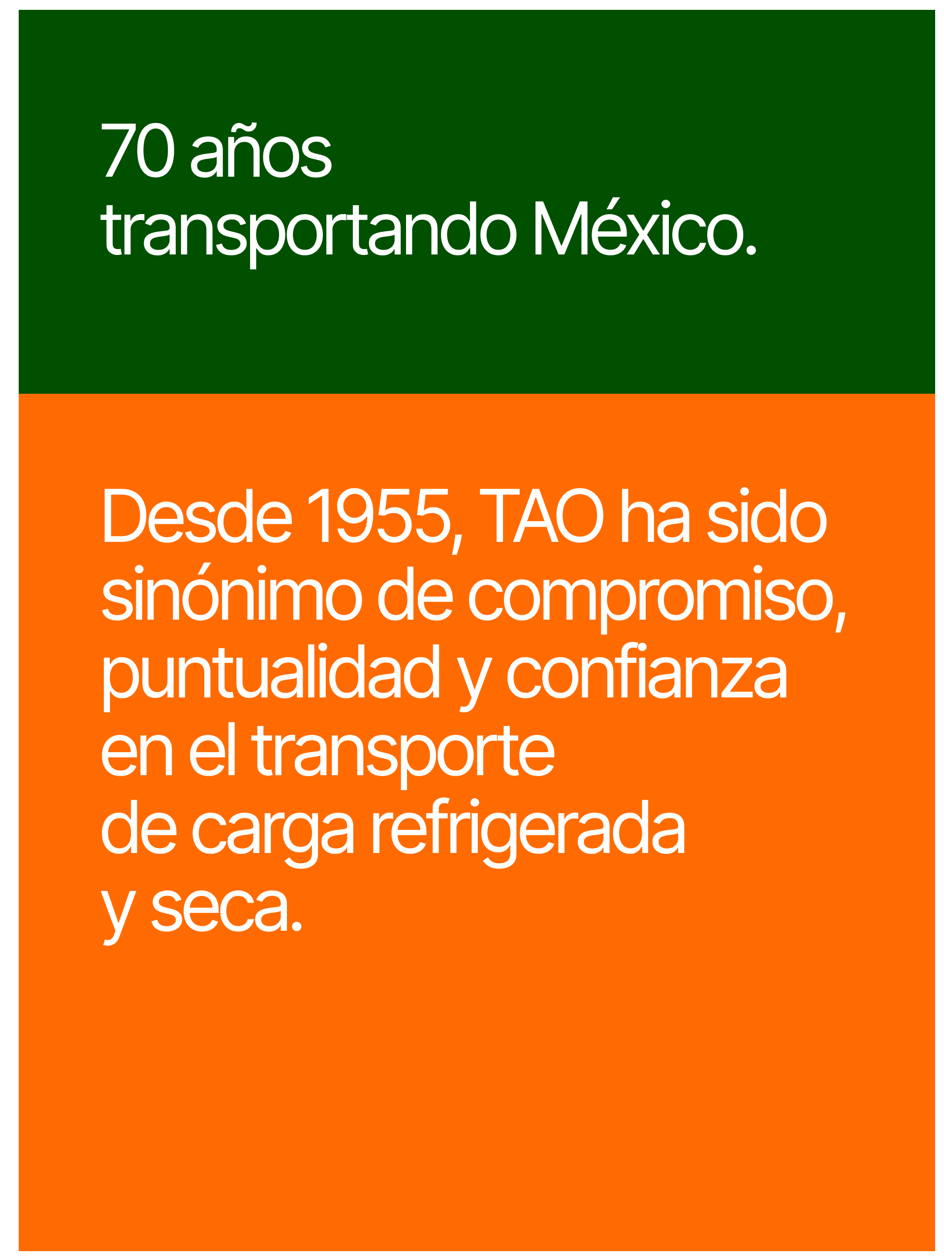
TAO’s rebrand marked a pivotal moment in the company’s history, celebrating its 70th anniversary while setting a clear direction for the future. The challenge was not to erase the past, but to reinterpret it with intention, creating a visual language that felt contemporary, confident, and grounded in legacy.
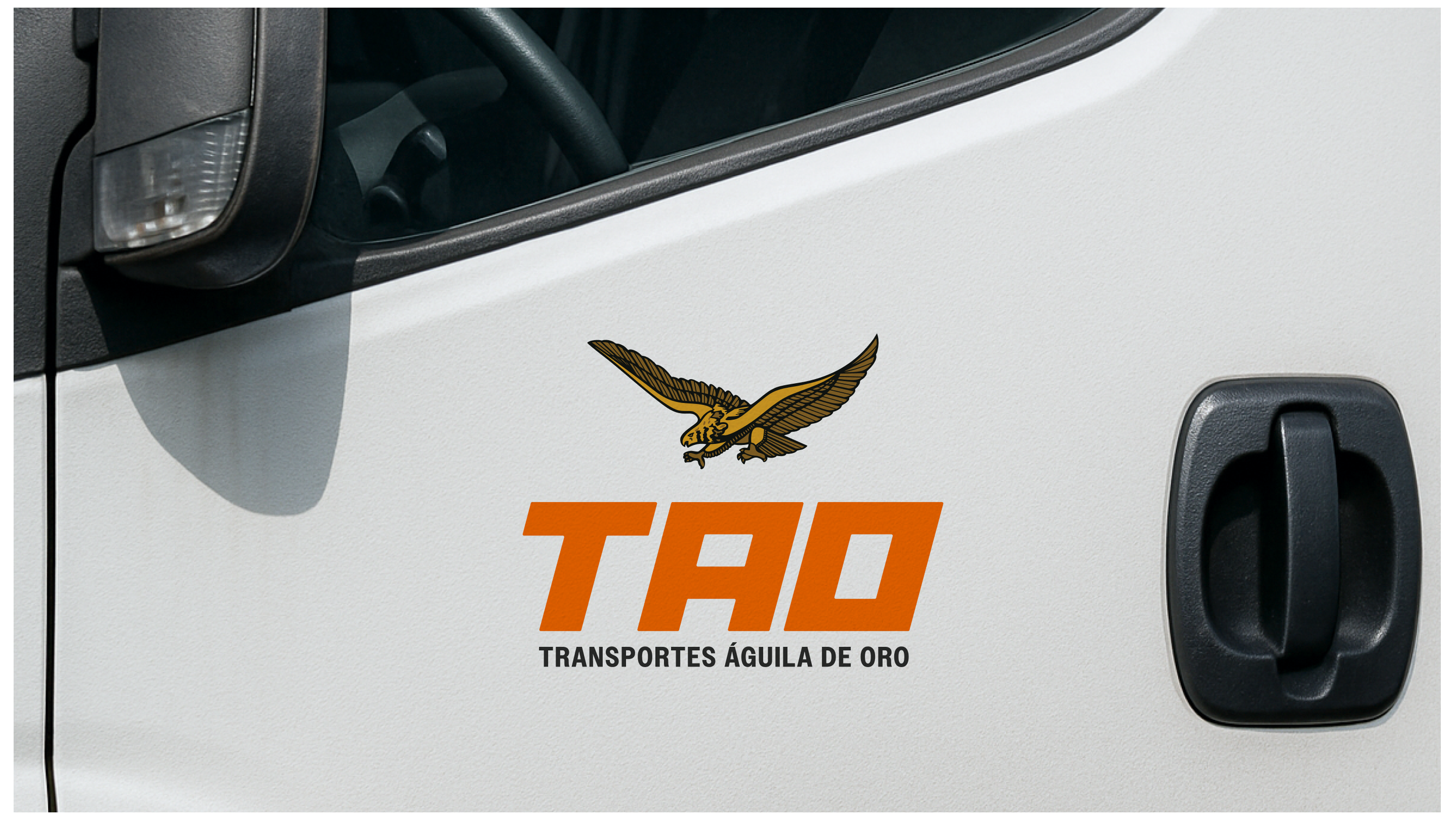
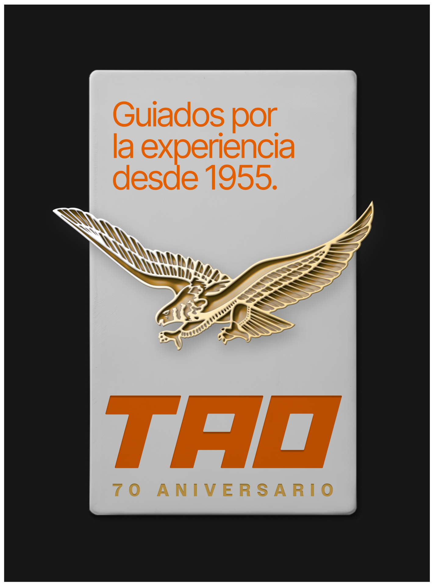
At the core of the project was the redefinition of the eagle as TAO’s iconic symbol. Rather than treating it as a decorative emblem, the eagle was refined into a strong, enduring element that reflects movement, strength, and continuity. The result is an identity that honors TAO’s heritage while positioning the brand for its next chapter, balancing tradition with clarity and long-term relevance for Transportes Águila de Oro.
